library(tidyverse)Week 09 – Describing Categorical Data
Introduction
This week we explore categorical variables using the fictional dataset of 150 summer-school students introduced in Week 1.
The aim is to learn how to describe categorical data, both:
numerically (using summary measures)
visually (using graphs in R)
Categorical data appear in many subjects, including education, health, psychology, linguistics, and business. In practice, we are often interested in questions such as:
How many individuals fall into each category?
What proportion of the sample belongs to each group?
1. Descriptive Statistics: What does it mean to describe a variable?
- We describe a variable by summarising its distribution
We usually want to know:
Where do the values tend to cluster?
→ the centre of the distribution
How are the values distributed?
→ the spread of the distribution
We can do this:
numerically with summary statistics
visually with plots (graphs)
The exact summaries depend on the type of variable
Nominal categorical variables (no natural order)
→ frequencies, percentages, mode, bar chartWe describe how observations are distributed across categories
The mode identifies the most common category
Ordinal categorical variables (meaningful order)
→ frequencies, percentages, mode, median, quartiles / IQR, bar chartBecause categories are ordered, we can identify the median
We can also describe spread using quartiles and the IQR
Getting started in R
To follow the examples, first load the tidyverse:
Then load the dataset:
students <- read_csv("Lecture1_data.csv", show_col_types = FALSE)You can view the first few rows:
head(students)# A tibble: 6 × 14
ID Degree Year Gender Study_hours Sleep_hours Stress_level
<chr> <chr> <dbl> <chr> <dbl> <dbl> <chr>
1 S001 Architecture 2 Female 6.8 7.4 Moderate
2 S002 Linguistics 1 Male 3.1 5.8 High
3 S003 English 2 Female 8.2 7.6 Low
4 S004 Philosophy 1 Male 5.5 6.7 Moderate
5 S005 Linguistics 2 Non-binary 4 5.9 High
6 S006 Linguistics 2 Female 7.4 7.8 Low
# ℹ 7 more variables: Satisfaction_Likert_item <chr>,
# Satisfaction_Likert_value <dbl>, Coffee_per_day <dbl>,
# Social_media_hr <dbl>, Exercise <chr>, Overall_mark <dbl>, IQ <dbl>Data exploration
Once we have a dataset, a natural first step is to explore it:
What variables do we have?
How many students are there?
What sort of values do we see?
We can use summary() to get a quick overview:
summary(students) ID Degree Year Gender
Length:200 Length:200 Min. :1.000 Length:200
Class :character Class :character 1st Qu.:1.000 Class :character
Mode :character Mode :character Median :2.000 Mode :character
Mean :1.925
3rd Qu.:2.000
Max. :3.000
Study_hours Sleep_hours Stress_level Satisfaction_Likert_item
Min. :2.100 Min. :4.200 Length:200 Length:200
1st Qu.:4.500 1st Qu.:6.000 Class :character Class :character
Median :5.900 Median :6.800 Mode :character Mode :character
Mean :5.845 Mean :6.758
3rd Qu.:7.200 3rd Qu.:7.600
Max. :9.900 Max. :8.600
Satisfaction_Likert_value Coffee_per_day Social_media_hr Exercise
Min. :1.0 Min. :0.000 Min. :0.800 Length:200
1st Qu.:2.0 1st Qu.:1.000 1st Qu.:2.300 Class :character
Median :4.0 Median :2.000 Median :3.100 Mode :character
Mean :3.6 Mean :1.825 Mean :3.191
3rd Qu.:5.0 3rd Qu.:3.000 3rd Qu.:4.200
Max. :5.0 Max. :4.000 Max. :5.700
Overall_mark IQ
Min. :43.00 Min. : 85.0
1st Qu.:57.00 1st Qu.: 98.0
Median :68.00 Median :104.0
Mean :66.24 Mean :103.6
3rd Qu.:74.25 3rd Qu.:109.2
Max. :86.00 Max. :126.0
Important
- For numeric variables, this shows the minimum, maximum, mean, and so on.
- For categorical variables, it shows the number of students in each category.
Important: How categorical variables are stored in R
For categorical variables, summary() behaves differently depending on how the variable is stored in R.
What is a character variable?
A character variable stores data as plain text (strings).
Each value is treated simply as a label
R does not recognise it as a categorical variable
It does not automatically count how many times each category appears
Example:
students$Degree [1] "Architecture" "Linguistics" "English" "Philosophy" "Linguistics"
[6] "Linguistics" "Philosophy" "Education" "Anthropology" "Sociology"
[11] "Design" "English" "Psychology" "Psychology" "English"
[16] "Psychology" "English" "Design" "Anthropology" "Business"
[21] "Sociology" "Linguistics" "Philosophy" "Linguistics" "Anthropology"
[26] "Business" "Politics" "Anthropology" "Linguistics" "History"
[31] "Anthropology" "Psychology" "Psychology" "Architecture" "Psychology"
[36] "Architecture" "Education" "Philosophy" "Linguistics" "Philosophy"
[41] "Politics" "Anthropology" "English" "Education" "Psychology"
[46] "Education" "Design" "Philosophy" "Linguistics" "Politics"
[51] "English" "Philosophy" "History" "History" "Anthropology"
[56] "History" "History" "Sociology" "Politics" "Linguistics"
[61] "History" "Psychology" "Architecture" "Politics" "Education"
[66] "Linguistics" "Linguistics" "Education" "Anthropology" "Education"
[71] "Philosophy" "Psychology" "Linguistics" "Education" "History"
[76] "Linguistics" "History" "Anthropology" "Linguistics" "Design"
[81] "Politics" "Politics" "History" "Architecture" "Philosophy"
[86] "Linguistics" "Philosophy" "English" "Education" "Linguistics"
[91] "Sociology" "Education" "Education" "Business" "Business"
[96] "Psychology" "History" "Business" "Politics" "Business"
[101] "Education" "English" "Philosophy" "Anthropology" "Psychology"
[106] "Politics" "Philosophy" "Linguistics" "Psychology" "Education"
[111] "Linguistics" "Design" "Politics" "History" "History"
[116] "History" "Linguistics" "English" "Linguistics" "Psychology"
[121] "Design" "Psychology" "Sociology" "Business" "Design"
[126] "History" "Linguistics" "Anthropology" "Architecture" "Politics"
[131] "Business" "Psychology" "History" "Design" "History"
[136] "Anthropology" "Sociology" "Linguistics" "English" "Sociology"
[141] "Psychology" "Anthropology" "Linguistics" "Linguistics" "Education"
[146] "Design" "English" "Anthropology" "Politics" "Anthropology"
[151] "Linguistics" "Linguistics" "Business" "Psychology" "Anthropology"
[156] "History" "Philosophy" "Psychology" "Philosophy" "Education"
[161] "Psychology" "Business" "Design" "Linguistics" "Linguistics"
[166] "Design" "Psychology" "Education" "Business" "Anthropology"
[171] "Design" "Sociology" "History" "Business" "Design"
[176] "Politics" "Anthropology" "History" "Business" "Anthropology"
[181] "Sociology" "Business" "Architecture" "Anthropology" "Psychology"
[186] "Psychology" "Psychology" "Anthropology" "Psychology" "Anthropology"
[191] "Design" "Business" "Education" "Politics" "Design"
[196] "English" "Linguistics" "History" "Design" "Philosophy" R sees values like "Education", "Linguistics", "Psychology" as text, not as categories.
summary(students$Degree) Length Class Mode
200 character character What is a factor?
A factor is R’s way of representing a categorical variable.
It stores categories as a set of levels
R understands that the variable consists of groups
It enables proper categorical analysis
When a variable is a factor:
R can count how many observations are in each category
Functions like
summary()return a frequency table
This is why we often convert variables using factor():
students$Degree <- factor(students$Degree)We check the type of variable of Degree using the function class ()
This tells you the type of the variable, for example:
"character"→ text"factor"→ categorical variable"numeric"→ numbers
class(students$Degree)[1] "factor"Now we run summary()
summary(students$Degree)Anthropology Architecture Business Design Education English
22 7 15 16 17 12
History Linguistics Philosophy Politics Psychology Sociology
20 29 15 14 24 9 Key rule
Before analysing a categorical variable, always check:
Is it stored as a factor?
What do we do next?
Now that we understand how categorical variables are stored in R, we can begin to describe them properly.
When working with a categorical variable, we follow a simple process:
Identify the type of variable Is it nominal or ordinal?
Check how it is stored in R. Is it a factor?
Describe the variable numerically
Frequencies and percentages
Measures of central tendency (mode, median)
Describe the variable visually Bar charts / Boxplots
We now apply this process step by step.
2. Describing Nominal Categorical Variables
- Nominal variables have no natural order.
Examples:Degree,Gender,Exercise.
Because categories are not ordered, we focus on:
how many observations fall into each category
which category is most common
2.1 Frequency distributions
The first step is always to create a frequency table.
students |>
  count(Degree)
# A tibble: 12 × 2
Degree n
<fct> <int>
1 Anthropology 22
2 Architecture 7
3 Business 15
4 Design 16
5 Education 17
6 English 12
7 History 20
8 Linguistics 29
9 Philosophy 15
10 Politics 14
11 Psychology 24
12 Sociology 9⚠️ Common error: “could not find function count”
If you get the following error, is because the library (tidyverse) is not loaded
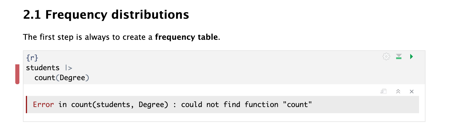
library(tidyverse)

students |>
  count(Degree) |>
  print(n = Inf)
# A tibble: 12 × 2
Degree n
<fct> <int>
1 Anthropology 22
2 Architecture 7
3 Business 15
4 Design 16
5 Education 17
6 English 12
7 History 20
8 Linguistics 29
9 Philosophy 15
10 Politics 14
11 Psychology 24
12 Sociology 9- Function
count()= “how many of each category?”
How to read this table
Each row represents a category of
DegreeThe column
nshows how many students are in each category
For example:
Architecture = 7→ there are 7 students studying ArchitectureThis table describes the distribution of the variable.
Ordering the table (most to least frequent)
Sometimes we want to see which categories are most common first.
We can reorder the table using arrange():
students |>
  count(Degree) |>
  arrange(desc(n))
# A tibble: 12 × 2
Degree n
<fct> <int>
1 Linguistics 29
2 Psychology 24
3 Anthropology 22
4 History 20
5 Education 17
6 Design 16
7 Business 15
8 Philosophy 15
9 Politics 14
10 English 12
11 Sociology 9
12 Architecture 7
What does this do?
arrange()sorts the rowsdesc(n)means:
→ order by the columnn→ from highest to lowest
Why is this useful?
This makes it easier to:
quickly identify the most common category (the mode)
compare categories
interpret the distribution more clearly
Note about R code: Using the Pipe Operator (
|>)
Using the pipe |>: reading left to right
Instead, we can write code step by step, using the pipe: |>.
The pipe:
takes the output on the left-hand side
and passes it as the input to what is on the right-hand side
You can read it as “and then”.
For example
1:10 |>
  diff() |>
  cumsum() |>
  log() |>
  mean() |>
  round()
[1] 1This is easier to read:
Take the numbers 1 to 10 and then take differences and then take cumulative sums and then take logs and then take the mean and then round.
We will use this style a lot in this course, especially with functions from tidyverse.
An example using our dataset
Let’s say we want to:
start with the
studentsdatasetpick the
Degreecolumncount how many students are in each degree
Using the pipe, we can write this clearly:
students |>
  select(Degree) |>
  count(Degree)
# A tibble: 12 × 2
Degree n
<fct> <int>
1 Anthropology 22
2 Architecture 7
3 Business 15
4 Design 16
5 Education 17
6 English 12
7 History 20
8 Linguistics 29
9 Philosophy 15
10 Politics 14
11 Psychology 24
12 Sociology 9How to read this
Take the
studentsdataand then ‘select’ the column called
Degreeand then ‘count’ how many times each degree appears
This is easier to read than nesting everything inside one line, such as:
count(select(students, Degree), Degree)# A tibble: 12 × 2
Degree n
<fct> <int>
1 Anthropology 22
2 Architecture 7
3 Business 15
4 Design 16
5 Education 17
6 English 12
7 History 20
8 Linguistics 29
9 Philosophy 15
10 Politics 14
11 Psychology 24
12 Sociology 9Another example
Imagine we want to:
take the
Yearcolumncount how many students are in each year
add percentages
students |>
  count(Year) |>
  mutate(Percent = round((n / sum(n))*100, 1))
# A tibble: 3 × 3
Year n Percent
<dbl> <int> <dbl>
1 1 63 31.5
2 2 89 44.5
3 3 48 24 Read it as:
start with
studentsand then count how many students are in each
Yearand then create a new column with percentages
About %>%
You may still see the older pipe symbol %>% in online examples:
students %>% select(Degree) %>% count(Degree)# A tibble: 12 × 2
Degree n
<fct> <int>
1 Anthropology 22
2 Architecture 7
3 Business 15
4 Design 16
5 Education 17
6 English 12
7 History 20
8 Linguistics 29
9 Philosophy 15
10 Politics 14
11 Psychology 24
12 Sociology 9It works in exactly the same way, but the newer |> is now preferred.
2.2 Numerical description: Proportions and Percentages
Frequencies tell us how many observations fall into each category.
However, we often want to understand:
How large each category is relative to the whole sample
We do this using proportions and percentages.
What is a proportion?
A proportion is the fraction of observations in a category.
\[\text{proportion} = \frac{\text{number in category}}{\text{total number of observations}}\]
Values range from 0 to 1
Example: 0.20 means 20% of the sample
What is a percentage?
A percentage is simply a proportion multiplied by 100.
\[\text{percentage} = \text{proportion} \times 100\]
Values range from 0 to 100
Example: 20% instead of 0.20
A percentage is just a different way of expressing a proportion.
When do we use proportions and percentages?
A percentage is just a different way of expressing a proportion, but they are used in different contexts.
Use proportions when:
performing calculations
working in statistical formulas
conducting inferential statistics (e.g. hypothesis tests)
Proportions are preferred because they are easier to use mathematically (values between 0 and 1).
Use percentages when:
reporting results
creating graphs and tables
communicating findings to a general audience
Percentages are easier to interpret and more intuitive to read.
Adding proportion and percentages to the frequency table
students |>
  count(Degree) |>
  arrange(desc(n)) |>
  mutate(
    proportion = round(n / sum(n), 3),
    percentage = round(n / sum(n) * 100, 1)
  )
# A tibble: 12 × 4
Degree n proportion percentage
<fct> <int> <dbl> <dbl>
1 Linguistics 29 0.145 14.5
2 Psychology 24 0.12 12
3 Anthropology 22 0.11 11
4 History 20 0.1 10
5 Education 17 0.085 8.5
6 Design 16 0.08 8
7 Business 15 0.075 7.5
8 Philosophy 15 0.075 7.5
9 Politics 14 0.07 7
10 English 12 0.06 6
11 Sociology 9 0.045 4.5
12 Architecture 7 0.035 3.5What the code does:
1. Start with the dataset
students→ This is our data
- Count observations
count(Degree)
→ Counts how many students are in each degree
→ Creates a column called n
- Order the table
arrange(desc(n))
→ Sorts the table from most common → least common
- Calculate proportion
n / sum(n)
→ Divides each category count by the total number of students
This gives the proportion (a value between 0 and 1)
round(..., 3)
→ Rounds to 3 decimal places
5. Calculate percentage
n / sum(n) * 100
→ Converts the proportion into a percentage
This gives values between 0 and 100
round(..., 1)
→ Rounds to 1 decimal place
Final table:
Example:
Linguistics = 29 students
→ proportion ≈ 0.15 → percentage ≈ 14.5%
We take the count for each category and divide it by the total to understand how large each group is relative to the whole sample.
2.3 Numerical description: Mode (central tendency)
So far, we have described how the data are distributed across categories (spread).
We now focus on the centre of the distribution.
Note on Measures of central tendency
When describing a variable, we often want to identify its centre.
Measures of central tendency are statistics that describe the typical or central value of a distribution.
There are three main measures:
The mean is the sum of all values divided by the number of observations.
\[\text{mean} = \frac{\text{sum of values}}{\text{number of observations}}\]
- Used for numeric variables
- Not appropriate for categorical data
The median is the middle value when the data are ordered.
- Used for:
- numeric variables
- ordinal categorical variables
The mode is the most frequent value.
- Used for:
- numeric variables
- categorical variables (nominal and ordinal)
What is the mode?
The mode is the most frequent category; the category with the highest count.
It represents the central point of a categorical distribution
It tells us which category is most typical
Identifying the mode in our table
Because we ordered the table from most to least frequent, the mode is:
students |>
  count(Degree) |>
  arrange(desc(n))
# A tibble: 12 × 2
Degree n
<fct> <int>
1 Linguistics 29
2 Psychology 24
3 Anthropology 22
4 History 20
5 Education 17
6 Design 16
7 Business 15
8 Philosophy 15
9 Politics 14
10 English 12
11 Sociology 9
12 Architecture 7
The most common degree is Linguistics, so this is the mode of the variable Degree.
Why do we use the mode?
For nominal variables, the mode is the only measure of central tendency we can use.
This is because:
categories have no natural order
we cannot calculate a median or mean
⚠️ Important: The median is NOT based on frequencies
A common misunderstanding is to think that we can find the median by:
- ordering categories by frequency (most common → least common), and
- picking the “middle” category
Example (incorrect reasoning)
Suppose we have this frequency table for Degree:
| Degree | n |
|---|---|
| Linguistics | 29 |
| Psychology | 24 |
| Anthropology | 22 |
| History | 20 |
| Education | 17 |
You might think:
“Anthropology is in the middle, so it is the median.”
❌ This is incorrect.
Why is wrong?
The table is ordered by frequency, not by the values of the variable.
- “Linguistics”, “Psychology”, “Anthropology”
do not have a natural order
What the median actually requires
The median is the middle value of the ordered data.
This means:
for an ordinal categorical variable → we order the categories according to their natural order
for a numerical variable → we order the numeric values
Key rule
If a variable has no natural order, it has no median.
2.4 Visual Description: Bar Charts
So far, we have described categorical variables numerically.
We now describe them visually, using graphs.
Bar charts are the most common way to visualise categorical distributions, as they show how many observations fall into each category.
Degree distribution
degree_barplot <- ggplot(students, aes(x = Degree)) +
  geom_bar(fill = "steelblue4") +
  labs(x = "\n Degree subject", y = "Count \n")
degree_barplot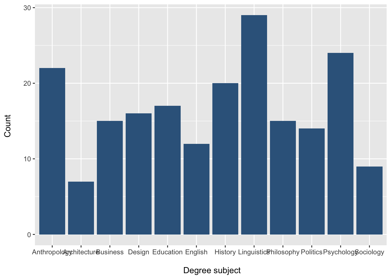
How to read this plot
each bar represents a category of
Degreethe height of each bar shows the frequency (count)
taller bars represent more observations
shorter bars represent fewer observations
This gives a quick visual summary of the distribution of the variable.
Changing the colour
We can change the bar colour using the fill = argument inside geom_bar():
degree_barplot <- ggplot(students, aes(x = Degree)) +
  geom_bar(fill = "darkgreen") +
  labs(x = "\n Degree subject", y = "Count \n")
degree_barplot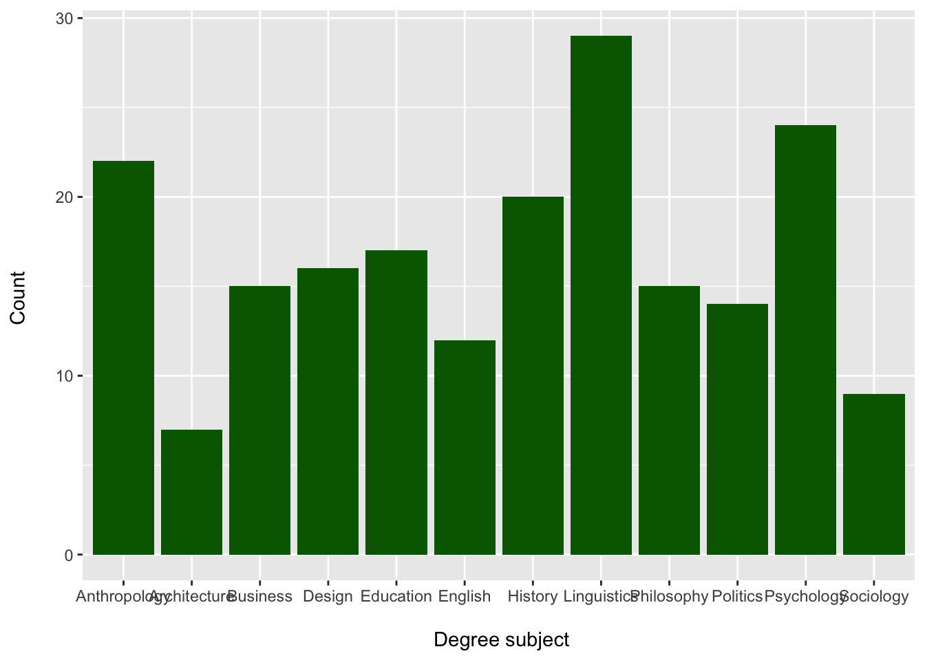
Changing the order of categories
Sometimes we want to control the order of categories in the plot.
For a nominal variable like Degree, there is no natural order, so we may choose an order that makes the plot easier to read.
Often, it is more helpful to display categories from most common to least common.
We can do this using fct_infreq() from the forcats package, which is included in the tidyverse.
students |>
  mutate(Degree = fct_infreq(Degree)) |>
  ggplot(aes(x = Degree)) +
  geom_bar(fill = "steelblue4") +
  labs(
    x = "\nDegree subject",
    y = "Count\n"
  )
What does fct_infreq() do?
fct_infreq(Degree) reorders the categories of Degree from:
most frequent to
least frequent
This makes it easier to:
identify the mode
compare category sizes
interpret the distribution quickly
Reverse the order: least common to most common
Sometimes we want the smallest categories first and the largest categories last.
We can reverse the order using fct_rev():
students |>
  mutate(Degree = fct_rev(fct_infreq(Degree))) |>
  ggplot(aes(x = Degree)) +
  geom_bar(fill = "steelblue4") +
  labs(
    x = "\nDegree subject",
    y = "Count\n"
  )
What does fct_rev() do?
fct_rev() reverses the order of the factor levels.
So:
fct_infreq(Degree)gives
most common → least commonfct_rev(fct_infreq(Degree))gives least common → most common
Why might we reorder a bar chart?
Reordering categories can make the graph easier to read.
For example:
most common → least common helps you spot the mode immediately
least common → most common can make differences between smaller groups easier to see
Want to learn more about ggplot?
For a deeper explanation of ggplot, including the grammar of graphics,
aesthetics, geoms, and themes, see the Plots & Grammar page.
3. Describing Ordinal Categorical Variables
Ordinal variables are categorical variables with a meaningful order.
Examples in our dataset:
Year(1, 2, 3, 4)Stress_level(Low, Moderate, High)Satisfaction_Likert_value(1–5 scale)
Because the categories are ordered, we can calculate additional summary measures.
We can describe:
distribution (spread across categories) → frequencies, proportions, percentages
centre → mode (nominal & ordinal), median (ordinal only)
dispersion (variability) → range and interquartile range (IQR) (only for ordinal variables)
Important distinction
Frequencies tell us how observations are distributed across categories
→ “how many are in each group”Dispersion measures tell us how spread out ordered data are
→ “how far apart the values are”
3.1 Frequency distributions
Some categorical variables in the students dataset have a natural order.
For example:
Year
Step 1: Inspect the variable
First, let’s take a quick look at the variable:
summary(students$Year) Min. 1st Qu. Median Mean 3rd Qu. Max.
1.000 1.000 2.000 1.925 2.000 3.000 This gives:
minimum = 1
maximum = 3
median and quartiles
At this stage, R is treating Year as a numeric variable.
We can confirm this:
class(students$Year)[1] "numeric"Why does this matter?
Although Year is stored as numbers (1, 2, 3), it actually represents categories with order, not true numerical measurements.
This means it is an ordinal categorical variable, not a continuous numeric variable.
Step 2: Convert to a categorical variable
We convert Year into a factor:
students$Year <- factor(students$Year)Check again:
class(students$Year)[1] "factor"Step 3: Look at the summary again
summary(students$Year) 1 2 3
63 89 48 Now the output shows:
- counts for each category (Year 1, Year 2, Year 3)
This is now a frequency table, which is what we want for categorical data.
Now that we have correctly treated
Yearas a categorical variable, we can describe its distribution using frequencies, proportions, and percentages.
⚠️ Important: Numbers do NOT always mean numeric data
Just because a variable contains numbers, it does not mean it should be treated as numeric.
For example:
Yearuses values 1, 2, 3
Satisfaction_Likert_valueuses values 1–5
These are codes for categories, not true measurements.
What’s the difference?
Numeric variables → numbers represent quantities
(e.g. height, income, age)Ordinal variables → numbers represent ordered categories
(e.g. Year 1 → Year 2 → Year 3)
Why does this matter?
If we treat ordinal variables as numeric:
- the mean may not be meaningful
- distances between values may be misleading
(is the gap between 1 and 2 the same as 4 and 5?)
What should we do?
- Convert to a factor for frequency tables and plots
- Use median and quartiles, not the mean, to describe the data
Always think: Do these numbers represent quantities or categories?
Frequency table
students |>
  count(Year)
# A tibble: 3 × 2
Year n
<fct> <int>
1 1 63
2 2 89
3 3 48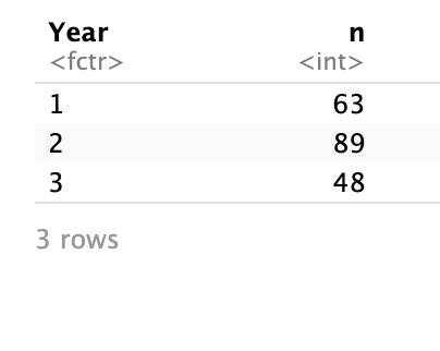
How to interpret this table
Each row represents a year of study
The column
nshows the number of students in each year
For example:
If
Year = 2andn = 89, this means there are 89 students in Year 2.
What does this tell us?
This table allows us to:
see how students are distributed across the years
identify which years have more or fewer students
However, counts alone can be difficult to compare.
For example, saying “89 students are in Year 2” is less informative than knowing what proportion of the sample this represents.
To better understand the distribution, we convert counts into:
proportions (values between 0 and 1)
percentages (values out of 100)
3.2 Adding relative frequencies (proportions & percentages)
We can also calculate proportions and percentages to better understand how the students are distributed across the years.
students |>
  count(Year) |>
  mutate(
    proportion = round(n / sum(n), 3),
    percentage = round(n / sum(n) * 100, 1)
  )
# A tibble: 3 × 4
Year n proportion percentage
<fct> <int> <dbl> <dbl>
1 1 63 0.315 31.5
2 2 89 0.445 44.5
3 3 48 0.24 24 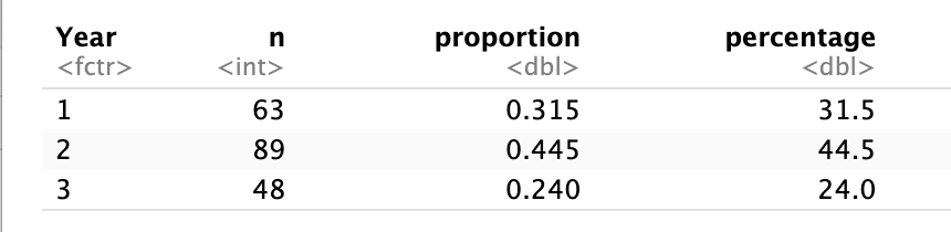
How to interpret this table
n→ number of students in each yearproportion→ share of the sample (between 0 and 1)percentage→ proportion of the sample (out of 100%)
Example
If
Year = 2hasproportion = 0.45, this means that 45% of students are in Year 2.
Why is this important?
It makes comparisons between categories clearer
It allows us to understand how the data are distributed along the ordered scale
Most importantly, it prepares us to calculate cumulative percentages, which we use to identify:
the median
the quartiles
Tip
frequency table → “how many”
proportions → “how much of the sample”
cumulative → “how data build up”
quartiles → “where key thresholds are reached”
3.3 Cumulative percentages
To understand how the data build up across the ordered categories, we calculate cumulative percentages.
Cumulative percentage The percentage of observations in a category or below it.
Calculate cumulative percentages
students |>
  count(Year) |>
  mutate(
    percent = round(n / sum(n) * 100, 1),
    cumulative = cumsum(percent)
  )
# A tibble: 3 × 4
Year n percent cumulative
<fct> <int> <dbl> <dbl>
1 1 63 31.5 31.5
2 2 89 44.5 76
3 3 48 24 100 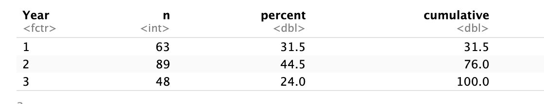
How to interpret this table
percent→ percentage of students in each yearcumulative→ percentage of students in that year or any earlier year
What is happening here?
As we move from Year 1 → Year 3, we are accumulating students:
Year 1 → percentage of students in Year 1
Year 2 → percentage in Year 1 and Year 2 combined
Year 3 → percentage in all years
The cumulative column shows how the data build up along the ordered scale
Why is this important?
Cumulative percentages allow us to identify key points in the data by seeing where the distribution crosses certain thresholds.
25% point → first value where cumulative ≥ 25% → Q1
50% point → first value where cumulative ≥ 50% → median
75% point → first value where cumulative ≥ 75% → Q3
Apply this to our table
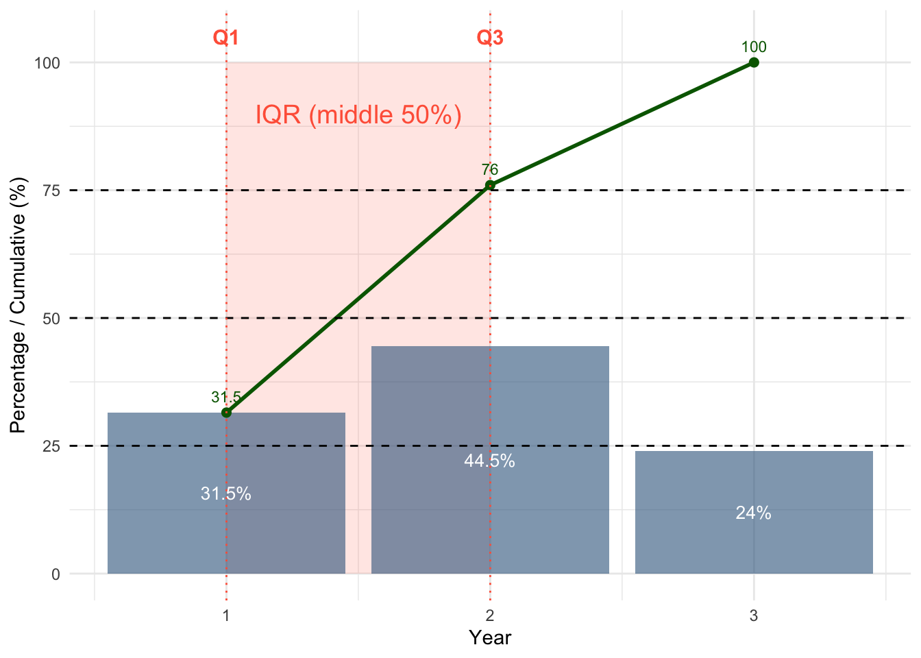
| Year | Percent | Cumulative |
|---|---|---|
| 1 | 31.5 | 31.5 |
| 2 | 44.5 | 76.0 |
| 3 | 24.0 | 100.0 |
Q1 (25% point)
We look for the first cumulative value ≥ 25
Year 1 = 31.5%
Q1 = Year 1
Median (50% point)
First cumulative value ≥ 50%
Year 2 = 76.0%
Median = Year 2
Q3 (75% point)
First cumulative value ≥ 75%
Year 2 = 76.0%
Q3 = Year 2
Quartiles are based on cumulative percentages, not on the size of each category.
Interpretation
Most students are in Year 1 and Year 2
The middle 50% of students are concentrated between Year 1 and Year 2
Very few students are in the highest category (Year 3)
Visualising cumulative percentages
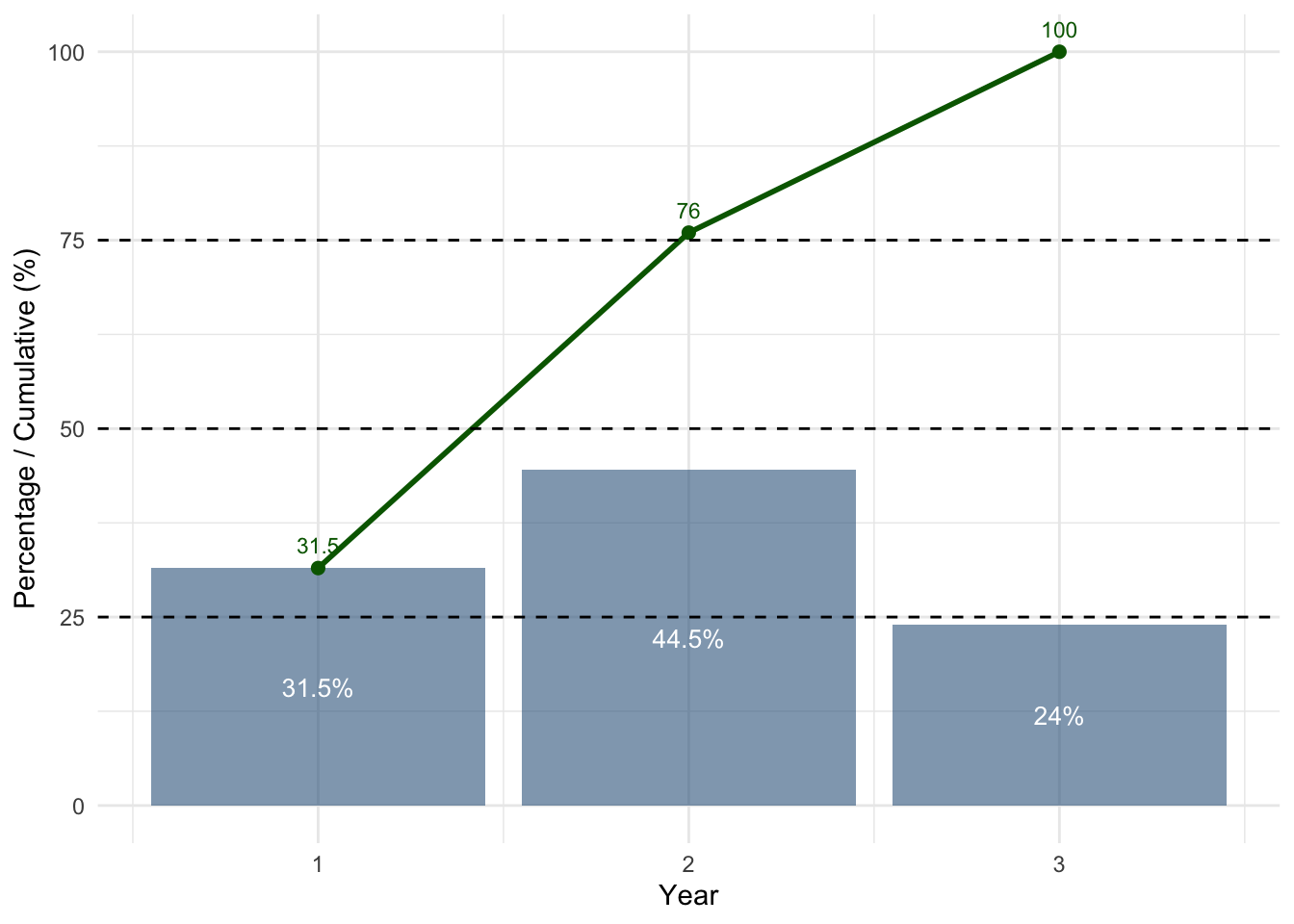
How to read this plot
Bars (blue) → percentage of students in each year
Green line → cumulative percentage
Dashed lines → 25%, 50%, 75% thresholds
What do we look for?
Where the black line crosses the dashed lines
Interpretation
The curve passes 25% at Year 1 → Q1
The curve passes 50% at Year 2 → Median
The curve passes 75% at Year 2 → Q3
Notice that Q2 and Q3 fall in the same category. This is normal when many observations are concentrated in one group.
Interquartile Range (IQR)
The interquartile range (IQR) measures how spread out the middle 50% of the data are.
It focuses only on the central part of the distribution, ignoring the lowest and highest values.
The IQR is calculated as: IQR = Q3 - Q1
Apply this to our example
From our previous results:
Q1 = Year 1
Q3 = Year 2
IQR = 2-1 = 1
In R
IQR(students$Year)[1] 1It means the middle 50% of students lie between Year 1 and Year 2, which are one category apart.
- so, “1” is a distance between categories
| Concept | Meaning |
|---|---|
| Q1 = 1 | starting category |
| Q3 = 2 | ending category |
| IQR = 1 | number of steps between them |
The IQR is 1. This does not mean “Year 1”. It means that the middle 50% of students fall within a range that spans one category level, from Year 1 to Year 2.
What does this tell us?
The IQR tells us the range of categories that contain the middle 50% of students.
While the median tells us the centre of the data, the IQR tells us how spread out the typical values are.
In this case:
- The middle half of students are between Year 1 and Year 2
The red shaded region shows the interquartile range (IQR): from Q1 to Q3.
This is where the middle 50% of students fall when the data are ordered.
Visualising spread with a boxplot
Because ordinal variables have an order, we can also visualise their centre and spread using a boxplot.
A boxplot is a compact visual summary of a distribution.
The box runs from Q1 to Q3. This is the interquartile range (IQR), so it contains the middle 50% of the data.
The line inside the box is the median. It marks the centre of the ordered data.
The whiskers extend from the box to the most extreme values that are still within 1.5 × IQR from Q1 and Q3.
Points beyond those limits are shown as outliers.
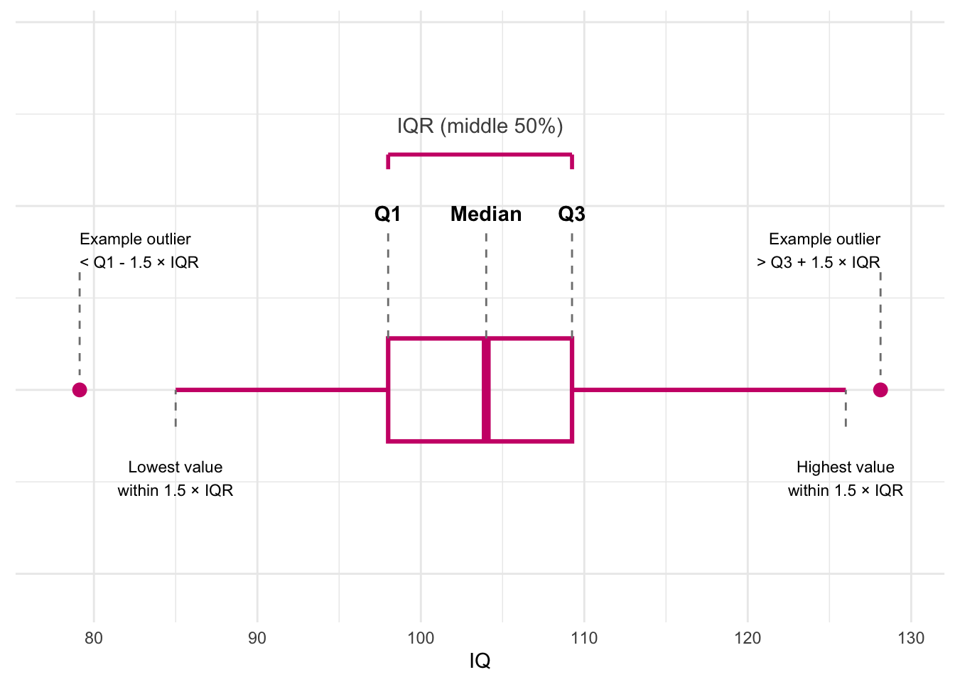
So, in order:
Q1 = lower edge of the box
Median = line inside the box
Q3 = upper edge of the box
IQR = width of the box
Whiskers = most extreme non-outlying values
Outliers = values below
Q1 - 1.5 × IQRor aboveQ3 + 1.5 × IQR
The box shows where the middle 50% of the data lie, the line inside shows the median, the whiskers show the most extreme typical values, and any separate points are potential outliers.
Boxplot Year
Because Year only has a few ordered categories, the boxplot will be less detailed than for a continuous variable like IQ, but it still summarises the same ideas:
Q1 = lower edge of the box
Median = line inside the box
Q3 = upper edge of the box
IQR = width of the box
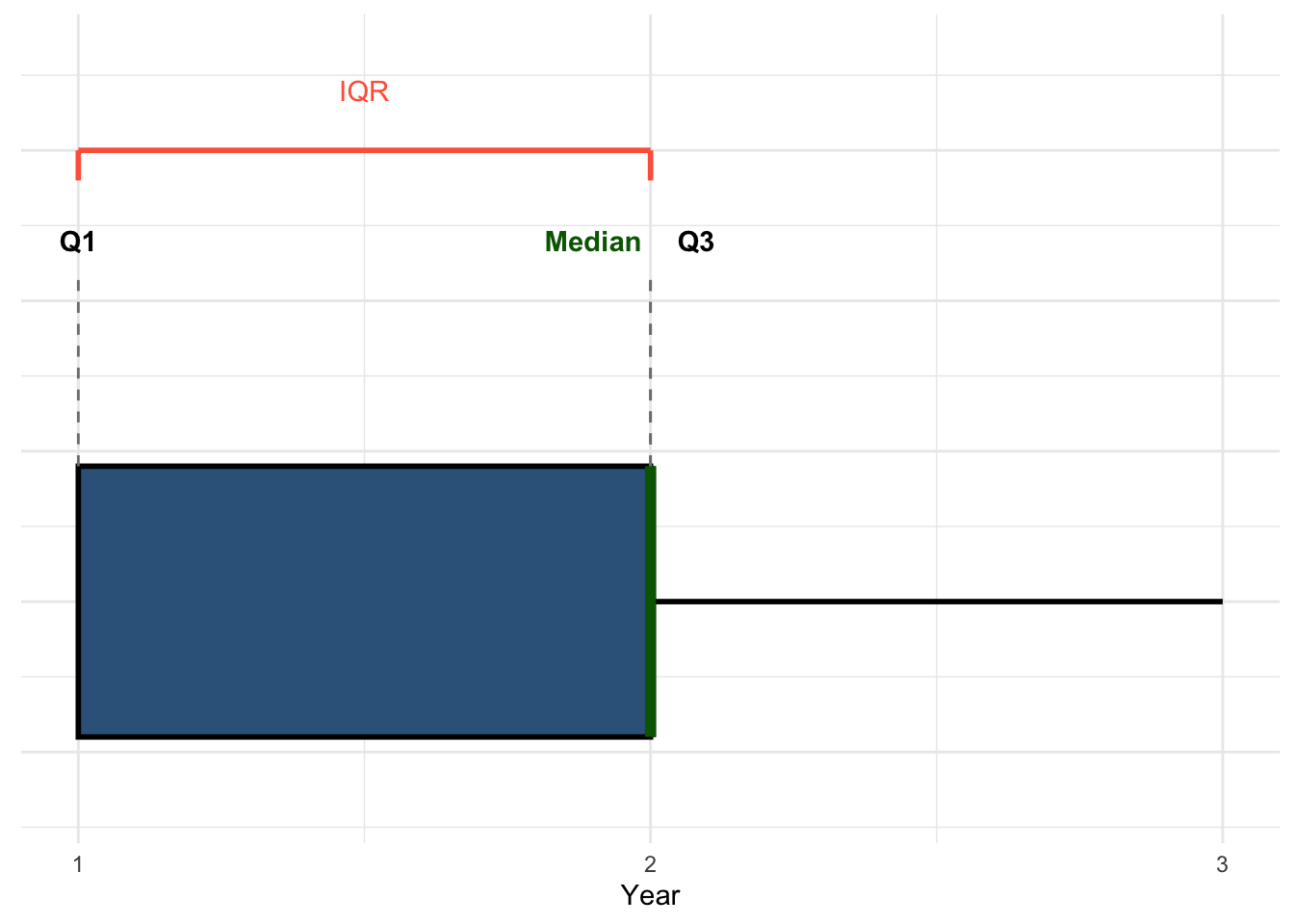
In this example, the median and Q3 fall in the same category, so the median line lies on the upper edge of the box. We highlight it separately in green to make it visible.
3.4 Visual Description
Ordinal variables can be visualised much like nominal variables, but with one important difference:
For ordinal variables, the categories must remain in their natural order.
For example, with Year, we keep the order:
1 = Year 1
2 = Year 2
3 = Year 3
We do not reorder these categories by frequency.
Bar chart using counts
A simple bar chart shows how many students are in each year.
ggplot(students, aes(x = Year)) +
  geom_bar(fill = "steelblue4") +
  labs(
    x = "Year",
    y = "Count"
  ) +
  theme_minimal()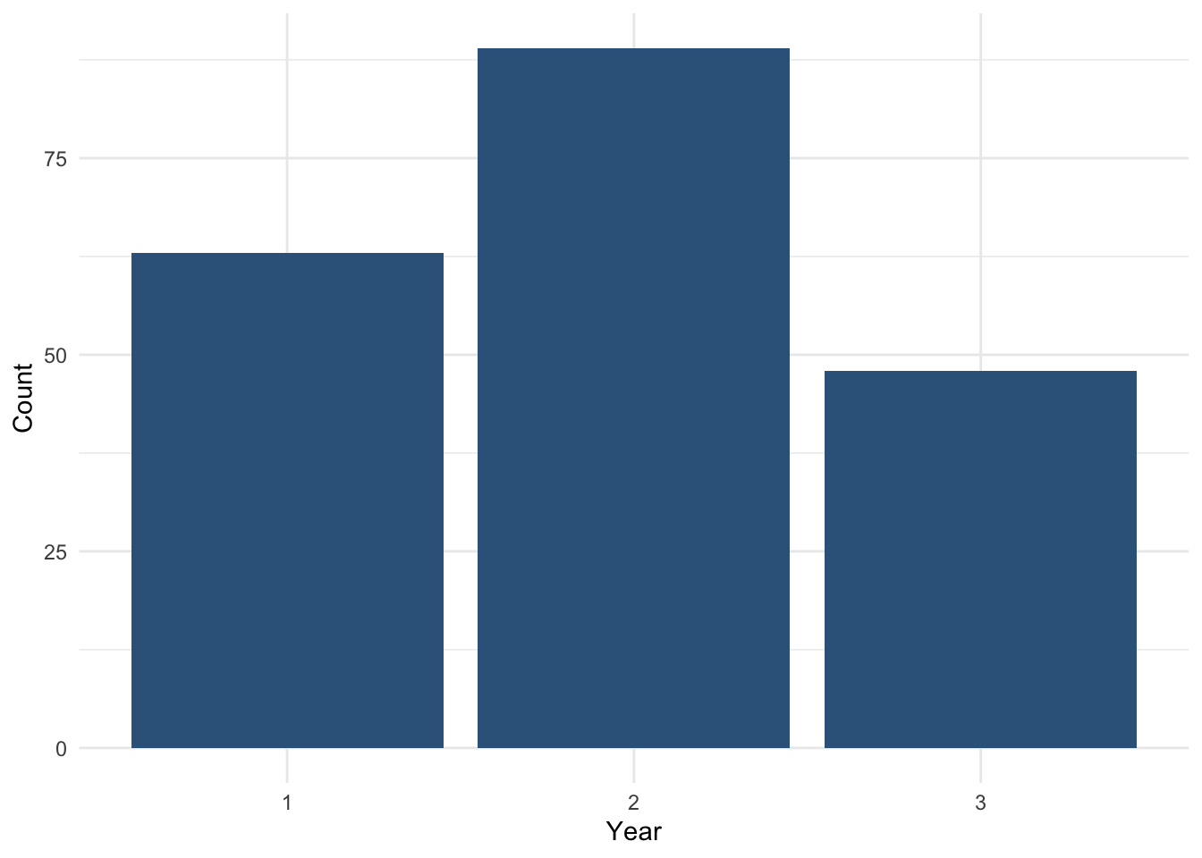
How to read this plot
each bar represents a year category
the height of the bar shows the number of students
because the categories are ordered, the bars move from lower to higher year
This plot gives a quick visual summary of how students are distributed across the ordered categories.
Bar chart using percentages
Sometimes percentages are easier to interpret than raw counts.
First, we create a summary table:
year_percent <-
  students |>
  count(Year) |>
  mutate(
    percent = n / sum(n) * 100
  )

year_percent
# A tibble: 3 × 3
Year n percent
<fct> <int> <dbl>
1 1 63 31.5
2 2 89 44.5
3 3 48 24 Then we plot the percentages:
ggplot(year_percent, aes(x = Year, y = percent)) +
  geom_col(fill = "steelblue4") +
  geom_text(
    aes(label = paste0(round(percent, 1), "%")),
    vjust = 1.5, colour = "white", size = 4
  ) +
  labs(
    x = "Year",
    y = "Percentage of students"
  ) +
  theme_minimal()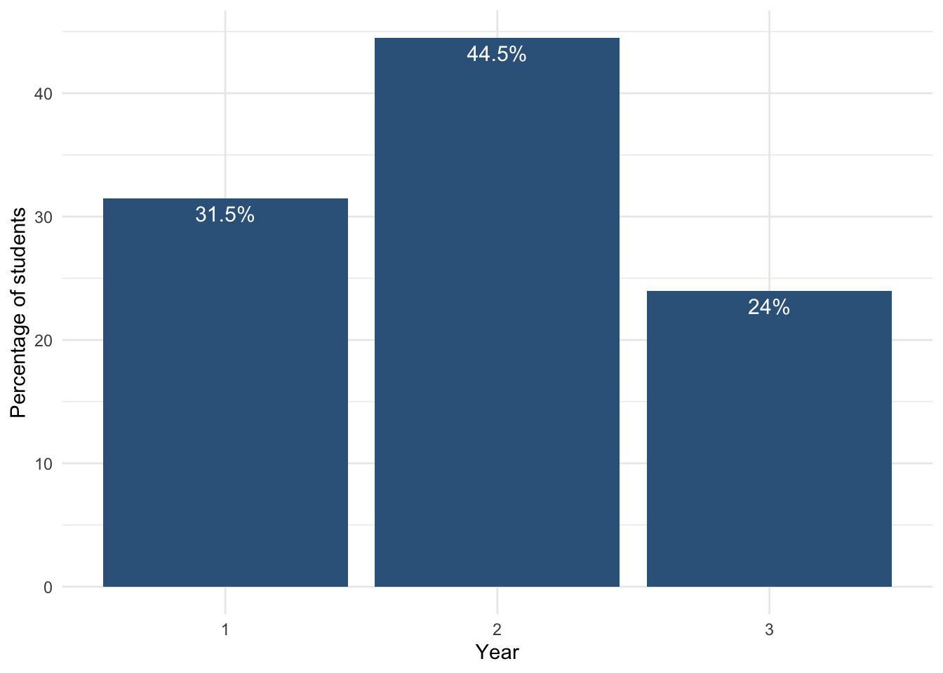
How to interpret this plot
each bar shows the percentage of students in each year
the height represents the relative size of each group
Year 2 has the largest share of students
Year 3 has the smallest share
This gives a clearer understanding of the distribution compared to raw counts.
Week 09 Summary: How to describe categorical variables
What to remember
When we describe a categorical variable, we want to understand:
- the distribution → how observations are spread across categories
- the centre → the typical or most common category
- the spread / dispersion → how spread out the ordered data are (for ordinal variables only)
Step-by-step process
1. Identify the type of variable
Ask:
- Is it nominal? → categories with no natural order
- Is it ordinal? → categories with a meaningful order
Examples:
- Nominal:
Degree,Gender,Exercise - Ordinal:
Year,Stress_level,Satisfaction_Likert_value
2. Check how the variable is stored in R
Before analysing a categorical variable, check whether it is stored as a factor.
Useful functions:
class()→ shows the type of variablesummary()→ gives an overviewfactor()→ converts a variable to a categorical variable
3. Describe the variable numerically
For nominal variables
Use:
- frequency tables
- proportions / percentages
- mode
Do not use:
- median
- quartiles
- IQR
because nominal variables have no natural order.
For ordinal variables
Use:
- frequency tables
- proportions / percentages
- median
- quartiles
- IQR
because ordinal variables have a meaningful order.
4. Describe the variable visually
For categorical variables
Use:
- bar charts to show counts or percentages across categories
For ordered variables
Keep the categories in their natural order.
Do not reorder ordinal categories by frequency.
5. For ordinal variables, use cumulative percentages
Cumulative percentages help us identify:
- Q1 → first category where cumulative ≥ 25%
- Median → first category where cumulative ≥ 50%
- Q3 → first category where cumulative ≥ 75%
Then:
- IQR = Q3 - Q1
Key rules
- No natural order → no median
- Numbers do not always mean numeric data
- Quartiles are based on cumulative percentages
- IQR measures the spread of the middle 50%
- For ordinal variables, the IQR value is a distance between categories, not a category itself
Main visual tools from this week
- Bar chart → shows the distribution across categories
- Boxplot → summarises median, quartiles, IQR, whiskers, and possible outliers
In one sentence
To analyse a categorical variable, we:
- identify whether it is nominal or ordinal
- check that it is stored correctly in R
- describe it numerically
- describe it visually
- for ordinal variables, use median, quartiles, and IQR