ggplot(data = dataset, aes(x = variable1, y = variable2)) +
geom_point()Week 13 – Correlation
1. What is correlation?
Correlation measures the strength and direction of a linear relationship between two numeric variables.
It answers the question:
When one variable changes, does the other tend to change as well?
For example:
As study time increases, do exam scores increase?
As stress increases, does sleep duration decrease?
As height increases, does weight increase?
Correlation does not imply causation. It only describes association.
2. When do we use correlation?
We use correlation when:
We have two numeric (continuous or interval/ratio) variables
We want to measure whether they are linearly related
Correlation is appropriate for variables such as:
Height and weight
Age and income
Study hours and test score
3. What correlation does (and does not) tell us
Correlation allows us to describe:
whether two variables are related,
the direction of the relationship (positive or negative),
the strength of the relationship.
Correlation does not:
establish causation,
tell us why the relationship exists,
allow predictions about individuals.
Example research question
Is the number of hours a student studies related to their overall mark?
This question involves:
Study_hours(numerical),Overall_mark(numerical).
Because both variables are numerical, correlation is the appropriate method.
4. Running a correlation: Correlation coefficient (r)
The most common measure of correlation is the Pearson correlation coefficient, written as:
\(r\)
Range of \(r\)
| Value of r | Interpretation |
|---|---|
| +1 | Perfect positive linear relationship |
| 0 | No linear relationship |
| -1 | Perfect negative linear relationship |
a) Direction of correlation
Positive correlation (r > 0)
As one variable increases, the other increases.
Example:
- More revision → higher exam scores
Negative correlation (r < 0)
As one variable increases, the other decreases.
Example:
- More stress → fewer hours of sleep
No correlation (r ≈ 0)
There is no consistent linear relationship between the variables.
b) Strength of the relationship
There are no strict cut-offs, but a common guide is:
| Approximate strength | |
|---|---|
| 0.00–0.19 | Very weak |
| 0.20–0.39 | Weak |
| 0.40–0.59 | Moderate |
| 0.60–0.79 | Strong |
| 0.80–1.00 | Very strong |
5. Visualising correlation: Scatterplots
Before calculating correlation, we should always visualise the data.
The appropriate plot is a scatterplot.
Each point represents:
One observation
One value on the x-axis
One value on the y-axis
In R:
To add a line of best fit:
ggplot(data = dataset, aes(x = variable1, y = variable2)) +
  geom_point() +
  geom_smooth(method = "lm", se = FALSE)
6. Calculating correlation in R
To perform a correlation test (including p-value):
cor.test(dataset$variable1, dataset$variable2)This provides:
r (correlation coefficient)
p-value
confidence interval
7. Hypothesis testing for correlation
When performing a correlation test, we test:
\[H_0 : \rho = 0\]
There is no linear relationship in the population.
\[H_1 : \rho \ne 0\]
There is a linear relationship in the population.
If the p-value is less than 0.05, we reject \(H_0\).
::: {.callout-note title=” “Interpreting the p-value”} The p-value tells us whether the correlation is statistically different from zero.
We test:
\[H_0 : \rho = 0\]
If:
If \(p < 0.05\), we reject \(H_0\).
If \(p \ge 0.05\), we fail to reject \(H_0\). :::
Interpreting the Confidence Interval
The 95% confidence interval gives a range of plausible values for the population correlation (ρ).
For example:
\[r = 0.52, \quad 95\% \, CI \, [0.30, 0.69]\]
This means:
We are 95% confident that the true population correlation lies between 0.30 and 0.69.
How CI connects to significance
If the confidence interval does not include 0, the result is statistically significant.
If the confidence interval includes 0, the result is not statistically significant.
Why?
Because 0 represents “no linear relationship”.
How p-value and CI work together
The p-value tells us about statistical evidence.
The confidence interval tells us about precision and plausible population values.
The correlation coefficient (r) tells us direction and strength.
10. Correlation vs causation
A crucial reminder:
Correlation does not imply causation.
Even if two variables are strongly correlated:
One may not cause the other
A third variable may explain both
The relationship may be coincidental
Example:
Ice cream sales and drowning incidents may both increase in summer — but one does not cause the other.
Running a correlation: steps
Step 1: Visualise the relationship
Before calculating a correlation coefficient, you should always inspect a scatterplot.
A scatterplot helps you check:
whether a relationship appears to exist,
whether it is approximately linear,
whether there are obvious outliers.
ggplot(students, aes(x = Study_hours, y = Overall_mark)) +
  geom_point() +
  labs(
    x = "Study hours",
    y = "Overall mark"
  )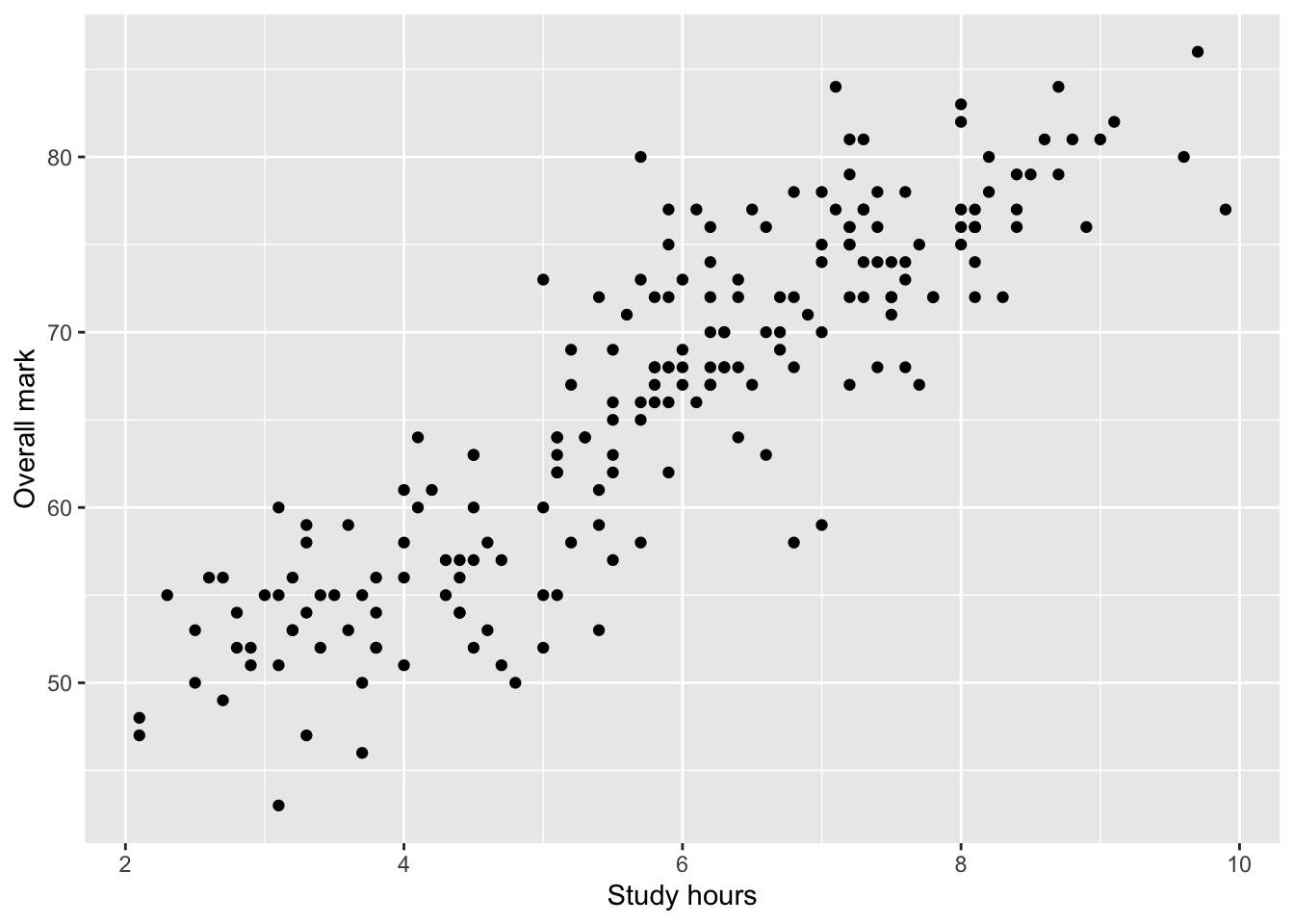
At this stage, you should describe what you see in words, without drawing conclusions.
The line of best fit (visual aid)
It is common to add a line of best fit to a scatterplot to summarise the linear trend.
ggplot(students, aes(x = Study_hours, y = Overall_mark)) +
  geom_point() +
  geom_smooth(method = "lm", se = FALSE) +
  labs(
    x = "Study hours",
    y = "Overall mark"
  )
`geom_smooth()` using formula = 'y ~ x'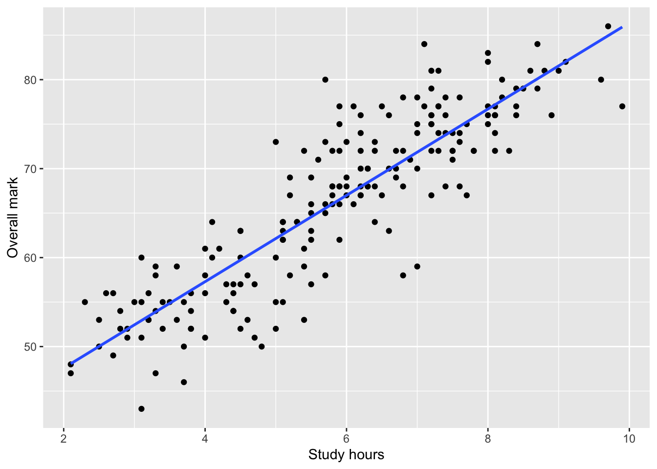
This line:
summarises the average linear relationship
helps visual interpretation,
does not imply causation.
You are not required to report regression results in this course.
Step 2: State the hypotheses
For a Pearson correlation test, the hypotheses are:
Null hypothesis (H₀):
There is no correlation between the two variables in the population (r = 0).Alternative hypothesis (H₁):
There is a correlation between the two variables in the population (r ≠ 0).
This is a non-directional hypothesis, so a two-sided test is used.
Step 3: Run the correlation test in R
We use cor.test() to calculate Pearson’s correlation coefficient and test whether it differs from zero.
cor_test <- cor.test(students$Study_hours, students$Overall_mark)
cor_test
    Pearson's product-moment correlation

data:  students$Study_hours and students$Overall_mark
t = 25.97, df = 198, p-value < 2.2e-16
alternative hypothesis: true correlation is not equal to 0
95 percent confidence interval:
 0.8433724 0.9072976
sample estimates:
     cor
0.879234
The output includes:
the correlation coefficient (r),
a confidence interval for r,
a p-value testing whether r differs from 0.
Interpreting the output
When interpreting a correlation test, follow this order:
Direction
Is \(r\) positive or negative?Strength
How large is \(|r|\)?Statistical evidence
Is the \(p\)-value smaller than \(\alpha = 0.05\)?
Always interpret the result in context of the research question.
Example interpretation
There was a strong positive linear relationship between study hours and overall mark,
\(r = .88\), 95% CI [.84, .91], \(p < .001\).This result was statistically significant, and the confidence interval does not include 0, suggesting evidence of a positive linear relationship in the population. Students who studied more hours tended to achieve higher overall marks.
What you are expected to do in assessments
When using correlation in your reports, you should:
clearly state the research question,
identify both variables as numerical,
include a scatterplot,
report:
r,
confidence interval,
p-value,
interpret direction, strength, and statistical evidence,
avoid causal language.
Important
Correlation only measures linear relationships.
If the relationship is curved (nonlinear), the correlation may be close to zero even when a strong relationship exists.