# R code goes hereUsing R Markdown for MSDA Reports
Code chunks, figures, tables, and knitting to PDF
What R Markdown is (in MSDA)
In MSDA, all tutorial work and assessed reports are written in R Markdown.
R Markdown files:
- use the file extension
.Rmd - combine text, R code, and output in a single document
- are knitted to produce a final PDF report
.Rmd
An .Rmd file is a plain text file that contains:
- written analysis (your explanations and interpretation)
- R code (inside code chunks)
- output generated automatically from that code (plots, tables, numbers)
You should never copy and paste output manually into your report. Everything should be generated from the code inside the .Rmd file.
Knit → PDF
When you click Knit in RStudio:
- R runs all code chunks from top to bottom
- all output is inserted in the correct place
- the document is converted into a PDF
If the document knits successfully, it means: - all code runs correctly - all chunk labels are valid and unique - the report is reproducible
Reproducible reports
A reproducible report means that:
- anyone can re-run your
.Rmdfile - they will obtain the same plots, tables, and results
- the report does not rely on hidden steps or copied output
This is a core principle of data analysis in MSDA.
Code chunks
What is a code chunk?
A code chunk is a block of R code inside an R Markdown file.
It starts and ends with triple backticks and has a label, for example:
All R code in your report must be inside code chunks.
Why chunk labels matter
Every code chunk must have a label.
Chunk labels are used to:
- organise your document
- generate Appendix A: R code
- identify errors when knitting fails
If a chunk does not have a label, or if two chunks share the same label, your document may fail to knit.
Code chunk naming rules (very important)
Follow these rules exactly:
Lowercase letters only
✔enrollment-summary
✘EnrollmentSummaryNo spaces
✔admitrate-hist
✘admit rate histUse underscores
_, not hyphens-
✔cost-boxplot
✘cost_boxplotLabels must be unique
✔enrollment-hist
✔admitrate-summary
✘plot1
✘analysis
Correct example:
Figures
Chunk options such as fig.width, fig.height, and fig.cap must appear inside the curly braces of the chunk header {r}, after the chunk label.
How plots appear automatically
In R Markdown, any plot you create inside a code chunk will appear automatically in the knitted PDF immediately after the chunk.
This means you do not paste images into the report.
Instead, you write code that produces the plot.
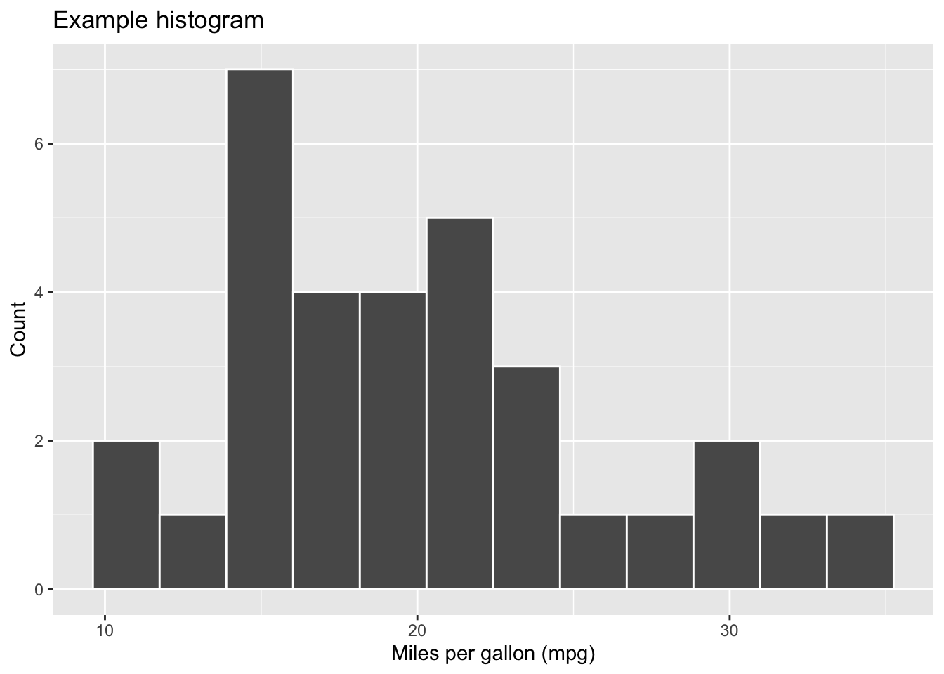
{r fig-label}
library(ggplot2)

ggplot(mtcars, aes(x = mpg)) +
  geom_histogram(bins = 12, colour = "white") +
  labs(
    x = "Miles per gallon (mpg)",
    y = "Count",
    title = "Example histogram"
  )
Controlling figure size (fig.width, fig.height)
If a figure looks too small or too large in the PDF, you can control its size using chunk options.
{r mpg_histogram, fig.width = 6, fig.height = 4}
ggplot(mtcars, aes(x = mpg)) +
  geom_histogram(bins = 12, colour = "white") +
  labs(x = "Miles per gallon", y = "Count")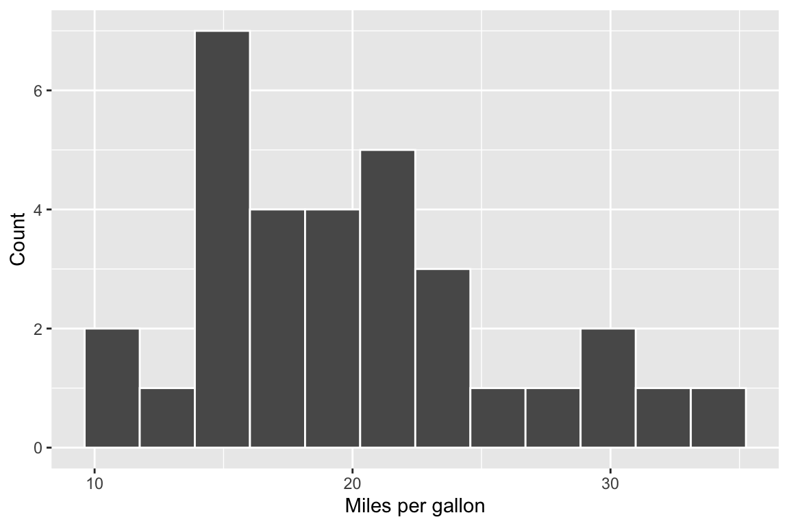
Figure captions (fig.cap)
Captions make your report easier to read and allow you to refer to a figure in your writing.
fig.cap="Distribution of miles per gallon (mpg) in the mtcars dataset."
{r mpg-histogram-captioned, fig.cap="Distribution of miles per gallon (mpg) in the mtcars dataset.", fig.height=4, fig.width=6}
ggplot(mtcars, aes(x = mpg)) +
  geom_histogram(bins = 12, colour = "white") +
  labs(x = "mpg", y = "Count")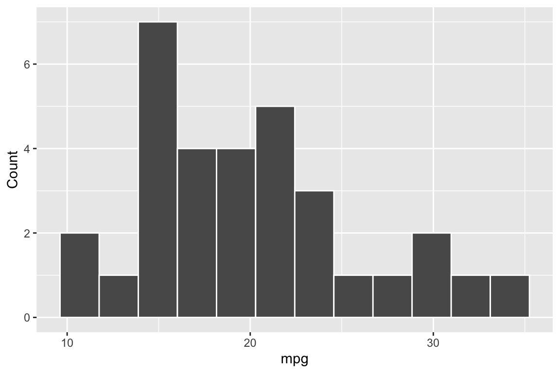
Why every plot must be generated inside a chunk
Plots created in the Console do not automatically appear in the knitted PDF.
To include a plot in your report, you must generate it inside a code chunk.
Tables
Why raw console output is not appropriate in a report
If you print a table directly, it often looks messy and hard to read in a PDF.
In MSDA reports, you should format tables so they look professional.
Using kable() to create a table
The kable() function creates clean tables suitable for reports.
{r mpg-summary-table}
library(dplyr)
library(kableExtra)

summary_table <- mtcars |>
  summarise(
    n = n(),
    mean_mpg = mean(mpg),
    sd_mpg = sd(mpg),
    min_mpg = min(mpg),
    max_mpg = max(mpg)
  )

kbl(
  summary_table,
  digits = 2,
  caption = "Descriptive statistics for mpg in the mtcars dataset."
)| n | mean_mpg | sd_mpg | min_mpg | max_mpg |
|---|---|---|---|---|
| 32 | 20.09 | 6.03 | 10.4 | 33.9 |
CODE : this line
caption = "Descriptive statistics for mpg in the mtcars dataset."adds the caption to the table.
Captions and referring to tables in text
A caption helps your reader understand what the table shows.
In your writing, refer to it clearly, for example:
Table
\@ref(tab:mpg-summary-table)summarises the distribution of mpg in the dataset.
When you knit, R Markdown will automatically turn that into “Table 1”, “Table 2”, etc.
Chunk options: quick reference
echo
echo = TRUEshows your code in the report (useful for tutorials)echo = FALSEhides your code but still shows output (often used in solutions)
include
include = TRUEshows code and outputinclude = FALSEhides everything from the report (even the output)Because
include = FALSEhides output, it is usually not appropriate for analysis chunks.
Cross-referencing figures and tables in your writing
When you include a caption for a figure or table, R Markdown (bookdown) numbers it automatically when you knit.
- To refer to a figure in your writing, use:
Figure \@ref(fig:fig-example-basic)shows …
- To refer to a table in your writing, use:
Table \@ref(tab:mpg-summary-table) summarises the descriptive statistics for mpg.
You should not type “Figure 1” or “Table 1” yourself, because the numbering can change as you edit your report.
Install TinyTeX
Only do this once, if your computer cannot knit to PDF.
install.packages('tinytex')
tinytex::install_tinytex()
# to uninstall TinyTeX, run tinytex::uninstall_tinytex()
Writing statistical notation correctly in your report
| What you want to write | Code to type in R Markdown | How it will appear in your report |
|---|---|---|
| Null hypothesis | $H_0$ |
H₀ |
| Alternative hypothesis | $H_1$ |
H₁ |
| Rho | $\rho$ |
ρ |
| Rho equals zero | $\rho = 0$ |
ρ = 0 |
| Not equal to | $\ne$ |
≠ |
| Significance level | $\alpha = 0.05$ |
α = 0.05 |
| p-value | $p$ |
p |
| Example p-value | $p = 0.032$ |
p = 0.032 |
| p less than .001 | $p < .001$ |
p < .001 |
| Correlation coefficient | $r$ |
r |
| Example correlation | $r = 0.88$ |
r = 0.88 |
| Chi-square statistic | $\chi^2$ |
χ² |
| Example chi-square result | $\chi^2(1) = 71.39$ |
χ²(1) = 71.39 |
| Degrees of freedom | $df$ |
df |
| Cramér’s V | $V$ |
V |
| Example effect size | $V = 0.36$ |
V = 0.36 |
| 95% confidence interval | $95\%$ CI |
95% CI |
| Example CI | $95\%$ CI $[0.84, 0.91]$ |
95% CI [0.84, 0.91] |
| Decision rule | $p < 0.05 \Rightarrow$ reject $H_0$ |
p < 0.05 ⇒ reject H₀ |
Common mistakes to avoid in statistical writing
Do not write plain text for statistical symbols.
Write$H_0$, notH0.
Write$\chi^2$, notchi2.Use italics for statistical symbols.
$p$,$r$,$V$, and$df$will automatically appear in italics when written in maths mode.Do not write p-values as “p-value = …” in results sentences.
Write$p = 0.032$,
not “p-value = 0.032”.Never write \(p = 0.000\).
If the value is very small, write$p < .001$.Include degrees of freedom for Chi-square tests.
Correct reporting format:
$\chi^2(1) = 71.39, p < .001$Use leading zeros correctly.
- Write
0.36for statistics such as$r$or$V$. - Do not write
$p < 0.001$. Write$p < .001$.
- Write
Do not interpret statistical significance as causation.
A statistically significant result indicates an association, not cause and effect.
📌 R Code Reference
Load data
library(tidyverse)
data <- read_csv("file.csv")
Inspect data
glimpse(data)
summary(data)
Subset data
data_subset <- data |>
  filter(condition)

data_subset <- data |>
  select(variable1, variable2)
Create new variable
data <- data |>
  mutate(
    new_variable = ...
  )
Count values
data |> count(variable)

data |> count(variable1, variable2)
Create contingency table
table(data$variable1, data$variable2)Proportions
prop.table(object)

prop.table(object, margin = 1)
Hypothesis test functions
t.test(variable ~ group, data = data)

cor.test(data$variable1, data$variable2)

chisq.test(object)
Extract values from test object
test_object$statistic
test_object$parameter
test_object$p.value
Basic ggplot structure
ggplot(data, aes(x = variable1, y = variable2)) +
  geom_...
Available geoms
geom_bar()
geom_bar(position = "dodge")
geom_bar(position = "fill")
geom_col()
geom_histogram()
geom_boxplot()
geom_point()
geom_smooth(method = "lm", se = FALSE)
Axis labels and formatting
labs(
  x = "...",
  y = "...",
  title = "..."
)

scale_y_continuous(labels = scales::percent_format())